OUGD 203 Evaluation
Collaborative YCN brief with Kate Dyer
Product, Range And DistributionDuring this module and these 2 briefs I have developed a more competent look at character design. I’ve found that not all styles work well together and that sometimes a drawing style has to be adapted to fit around the given content. This can be seen in the YCN collaborative brief that I did with Kate Dyer. We are both illustrative based designers yet we both have very different styles. Kate’s is rather unique where as I feel my illustrative skills are quite board and can be adapted.
When it came to choosing a partner for the the collab briefs, I was one of the stranglers left at the end. I think the problem I had was not asserting myself. I also made some really terribly "work with me!" poster. I spent too much time drawing a big daddy then focusing on what I wanted out of the collaboration. I would have proffered to work with someone with good type and layout skills as this is something I really need to brush up on over the summer.
However, I found that working with Kate was quite laid back and not as intense as she first made out she was. She stated that she needed someone to keep her in line and that she could could be quite mean. I didn't see this at all, but I did keep in touch with her over email as well as phoning her to make sure she came in to work on the collab brief with me.
There was a little bit of trouble in getting the brief started. We where so full of idea's that it took us longer than it should have to actually get on with designing. We went back over the brief and outline where Ted Baker had stated that they didn't want the whole "leaves in shop windows" that other shops around them would be doing. I'll admit that it took us a week to spot this and try our new idea; A Mary Poppins theme.
In the past Ted Baker had done a theme based on Alice in Wonderland but we didn't want it too look so obvious that it was another Disney envisioned story. We took elements from the story like the Mary Poppins figure being blow away in the sky and the chimney sweeps working in a rather modern setting. (As can be seen by the London eye in the background.)
We where interested in a very illustrative scene. This made sense by the fact that it was for a shop window and that we needed something enticing to draw in a crowd. Personally, I don't think thesis works with the muted sepia tones. Unless we wanted to go for the whole "Sepia in real life" theme rather like the Disney shops black and white puppet scenes above their shelves.
We essentially tried to pull away from Ted Baker having a shop displays with little or no meaning. Rather like their plucked chicken they had a few months ago. The shop and the website have a elegant feel to it, despite it claiming it's friendly and down to Earth approach. Another thing we encounted was that many people had a low view on Ted Baker, viewing it as something only "chavs" where. Whether this be through fake knock off's or the real thing. Yet surprisingly the other groups dealing with Ted Baker did not receive the same results in their own surveys. I guess that's down the different types of friends each pair had.
A few things I regret not doing is making an actual mock up for the shop, as well as he instore merchandise. I feel that this is where we could have done more regarding clothe tags and hanging banners inside the shop.
For the second part of Design Practice 2 module I chose to write my own brief so I could focus more on illustrating and crater designs.I chose to work on the "my dogs are barking" brief that deals with idioms and phrases that occur in every day language. My focus was on the dialects of the English language and how this could be explored through character design.
I started by doing research into existing examples of human personification of other non sentient things like countries and nature. An example I looked at and was already fond of is the "Scandinavia and the world" comic strip by a Danish Cartoonist. This was a direct response to a Japanese comic book "Axis powers; Hetalia." My characters and story behind how it would work is a little more light hearted and innocent than SaTW and APH (Who both deal with siltations of war and politics.) During the summer I intend to expand on my own characters story wise to see if I too can depict them in a similar way.
I'll admit that though I wanted to do character design, I was taking a long time to sit down and illustrate. I was too worried how they could be put into context thinking that I would have to design the insides of little translation books. This was not the case as it was explained to me that the characters themselves are the products. (One being the product, the other 6 being the range of characters and finally the books/stationary and web presence is how they are ultimately distributed.)
I finally started drawing the characters through research I had already collected about them. I didn't want them to be obvious yet I also wanted people to realise who they represented. This is where I kept hitting the same problem. Some people figured out straight away who each of the characters where, were as others had trouble seeing this. I tried to apply the same flag motif in the case of Tyke (Yorkshire) to the other dialects but this was not to be. The problem being that not all the dialects had an associated flag with their city's/regions. In the case of Manchester, Liverpool and Newcastle all I could find where the football logo's which had originally being derived from the crests of the city.
I settled on a style for the characters very early on and this is a problem that was addressed in my crits. They liked the characters, yet it was felt that perhaps I should have tried different versions. (young/old...ect.) Personally I feel I could have done more in the way of scenes for the characters. Especially having them interact with each other. A narrative look at design is something I want to focus on in my 3rd year and perhaps experimenting with these characters in the summer will help.
What I had initially hoped for was a set of characters (achieved) a set of scenes (not achieved) stationary, book marks and posters. The last two would have been really easy to have made yet I spent too much time trying to get the books the books are stored in to the right size.
This was another problem for me; craft problems. It turns out that I am not very good at making boxes yet I really wanted to have something to hand in along with my stationary set.
The part of the distribution I am least pleased about is the web presence. I wanted to show that when clicked on a character, it would link you to the city and a small profile page would pop up. (this would have explained why the character represented that dialect.)
Over all, I am rather pleased with how the characters turned out (especially Manchester and Yorkshire being my favourites.) but I really would have proffered to have done more with them narrative wise.
Things I would do differently next time:
- Get a print slot booked early.
- Blog every night and regally as to not go back over myself.
- I'm a designer. I need to start designing almost straight away combined with the research then back and forth. Not just one and then the other.

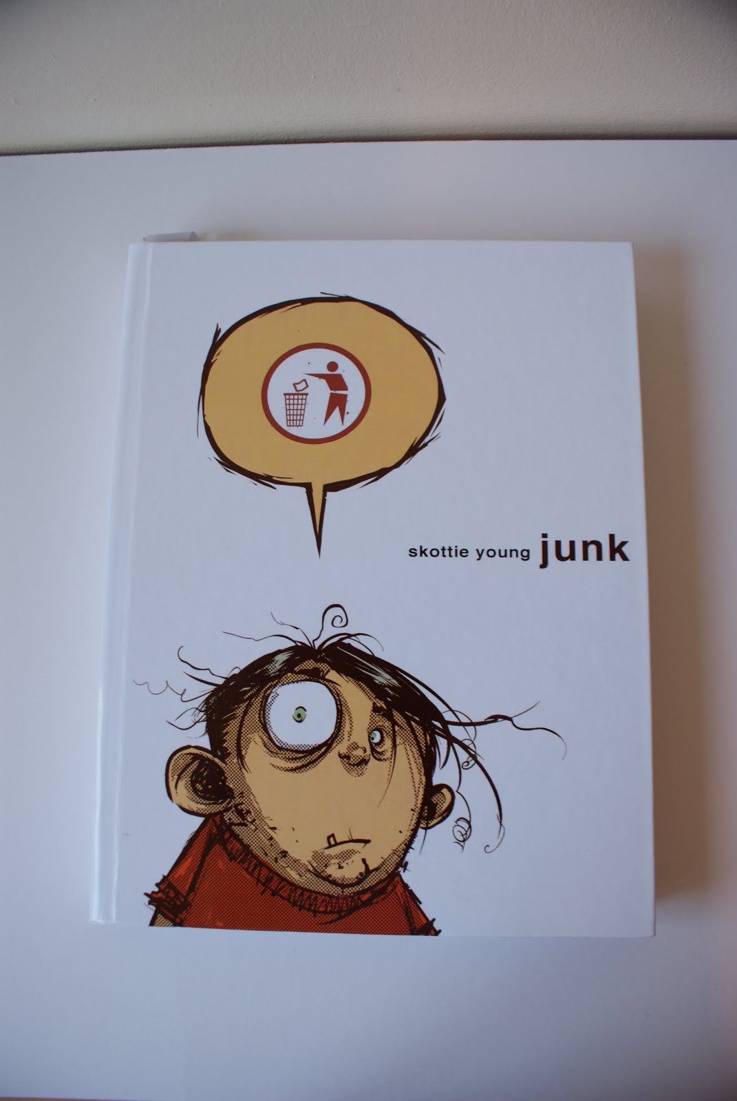


 New designs for one of the new X-men before Marvel decided they would go on a killing spree. Despite that, I esspeically like the differnt variations Skottie went through for the character.
 SY's Pixie before Greg Land ....Gred Landed her with the body of a 25 year old super model and the mind of a pre teen.