Thursday, 19 August 2010

Style Icon

Style. Artistic expression. Or; why I draw the way I do.

A 'problem' I brought up at the end of the second year was worrying that I had not developed any kind of style. That no one would be able to look at my work and go: Oh, that's Leigh Wortley's. (Or more accurately; that's the girl who talks to much about the X-men.)

I've come to the decision however (one that I think was made for me by people around me) that I don't need a style. Especially not in an illustration sense. This would pigeon hole me and limit what I could do with myself as a designer and an illustrator.

As a test I started to illustrate Jubilee (of the x-men, who else) in the same style that I have done my header image in. I wanted to see if it could work across media (from real life to comic books.)


The Jubilee one is still my favourite. It was the first one I did and I didn't get any better at it. XD
After I posted my own caricature, I had requests from friends for me to do illustrate them too. However, I'm not Wonder Woman (Though her new costume is quite spiffy) And I only managed to do Jonny P.

Other requests include my kid sister and Emma Price. She's getting her's for her birthday though.

Next post. My other way of doing things.

Saturday, 5 June 2010

Behance Vs DeviantArt

Clearly Behance wins for it's professional feel and quality, yet I am on both sites.


Nothing on my Behance site yet. (I became very frustrated trying to upload, even when people told me how easy it was. Herding wasps out of my room is easier.)


(Adam's Type piece on me from the 3rd year is up on there. It's ok though, I linked to his blog)


I'm aiming to use my behance for my professional work, and high quailty work. (Or as high as I can produce.) For my DA, I've usually posted my little illustrations, silly little things and but not my general uni work. (In the last year I've put a small amount of uni work up but it's not what I use it for.)

Friday, 4 June 2010

Vanilla Vs Rocky Road

Mike Choi is a great illustrator and Marvel artist, whose "style" I have always appreciated and thought simply beautiful. However, Mike has a different view on the matter:

"I'm still at the point where I see my development as an artist basically coming down to honing my ability to see and correct what is wrong.

Which is why I don't think I have a style yet. I think development of aesthetic style is the next step, when you purposefully add stuff to your work that you think is RIGHT, on top of the stuff that is simply correct."


But he DOES, have a style. Or perhaps I'm looking at this the wrong way. Is the way someone draw, just that...and not their ultimate style. Hmm. Some samples of Mike's great work.


"I have a vanilla ice cream vs. rocky road ice cream analogy to describe my approach to art. Basically, my analogy is that everybody likes vanilla ice cream. But no one LOVES it (yes, generalisations all around.) But in order to get to the flavors that people LOVE, you need to start adding elements to it to cater to people's finer tastes (like chocolate, almonds, and marshmallows.) But the more you deviate from vanilla, the more people's tastes you deviate from, so as you add people who go from simply liking your work to loving it, you also get more people who go from liking or being ambivalent about your work to liking it less or even hating it.

Right now, my approach is simply to make the best vanilla ice cream I can. But I've started to look at some of the flavors I could add, and these are all flavors I like, and hopefully a lot of my current fans will too.

Ooh! Coconut!"


This is something that came up in my presentation feedback. Do I need to develop a style? no, not really. There's no reason to add a little bit of myself into my work, everybody does, but I don't need to put myself in a corner. I don't just want to attract the coconut lovers to my work.

Thursday, 3 June 2010

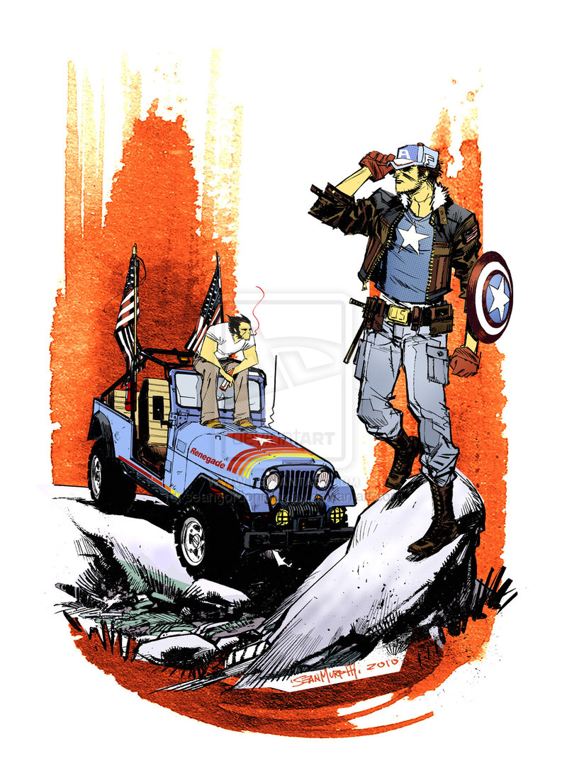
Sean Murphy's Alphabet

Sean Murphy is a great comic artist, and I really wanted to show the great depth he goes to creating his illustrations. Each Illustration is dynamic and there's a meaning behind each letter. (Such a Z, in which it shows Logan's past in the Canadian air force and the future; 2 of his children.)

Hook moment. "Logan's Got's Kids!"


Portfolio Revised


Revised portfolio with my added CV in the back.

Wednesday, 2 June 2010

2nd Year Presentation!


  1. Intro, name ect
  2. What is good:
    Dyslexia Depot. Dyslexia is good.
    Though when it comes to spelling, dyslexia really isn’t that good unless you have a dam good spell checker. What I liked about this brief was my small step in the direction character design. And yes it was very small but it was something I wanted to delve more into.
  3. Print booklet:
    I’ll admit that I still have the basic understanding of print and I wish I had done a little bit more research into the different printing methods. There where some really good booklets being designing on the course and I don’t think that mine quite cut it. However, I was quite impressed and pleased with the over grade I got for the module and it was something I wanted to keep up with for the rest of the year. This would give me something to work towards.
  4. Digital module:
    After effects is not my fortay. I was really looking forward to this module because I’ve always had a thing for animation though it didn’t go quite to plan. I had a few troubles trying to wrap my head around After Effects and in the end I didn’t have an all sing all dancing set of indents…however, what I did have worked for what I as planning and my final grade was so much better than what I have been expecting. And I got watch allot of films about robots!
  5. Product Range and Distribution:
    Character Design! The area in which I want to develop more when I go into the 3rd year as well as when I leave the course. I don’t think I’ve done it much justice yet as I need to broaden my illustrative skills and develop them more during the summer.
  6. Free lance work:
    Is both a pain in the ass and welcome. It meant I was doing something different and album art work was never something I’d done. I had a client who was a angel to work for and one that I wanted to punch every time he sent me a rude email or condescending phone call. The end result for his was nothing I was proud of as he had a designer working with him, yet he wouldn’t let me design. For next time, I’m going to sit down with the client and make sure they read the brief and that we outline specific problems and thing’s that need addressing.
  7. Plans for summer:
    As well as my dissertation research and a trip to Newcastle to Paul Windle Design, I’m planning to focus my design skills on character design and comic scripting. As it is the area I want to go into then I dam well need to brush up my skills or I’m never going to achieve the professional level that I need to.
  8. 3rd year: HA! (I’m going to turn into a hermit crab. I’ve even started browsing for shell’s, but really I’m going to try and be more focused on the area of design I want to go into.)
End Slide! (I am not young enough to know everything.)

PR3: The Hallowed Seam

The Hallowed Seam collects the sketches of renowned artist James Jean, who has documented his life in drawings and paintings. From beautiful figure drawings to experimental paintings, Jean demonstrates a keen eye for humanity and a virtuosic handling of any medium.


A bought this last summer and it's been a really useful guide for life drawing. (Somthing I want to get back into to improve my own branch into character design.)